
As times change, iconic brands seem to stand still. Coca-Cola’s signature red background and white cursive has withstood world wars, economic depressions, and innumerable trends in the beverage industry.
But look closely and great brands are the ones in near-constant flux. To be iconic you first need to be innovative. Coca-Cola’s trademark red and white may have stuck since 1886, but the brand itself has changed decisively. Coca-Cola has introduced new characters via ad campaigns, like the Coca-Cola polar bear. They’ve traveled to places like Vietnam to start recycling initiatives. The original glass bottle has gone through dozens of redesigns.
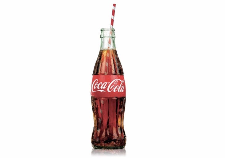
The Coca-Cola bottle is an icon, but has gone through many redesigns. Image source: Coca-Cola
The definition of a “brand” has expanded since Coca-Cola began. Now it’s even more important to build an identity that shape-shifts.
“The set of expectations, memories, stories and relationships that, taken together, account for a consumer’s decision to choose one product or service over another.”
This is how Seth Godin (“marketing legend”) describes a brand. Take this definition as truth and the prospect of actually designing a brand with purpose seems like a fool’s errand. Stories and memories and expectations are so messy. How can we control that mess? How can we cultivate a brand that’s iconic but always in flux?
Here’s how 10 innovative brands (big and small) have evolved without losing their originality, and how you can follow their lead (in your own inimitable way of course):
1. Smári – Keep original elements pure, while making product appeal universal
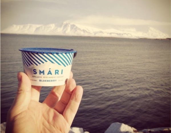
Smári keeps its branding simple, with hints of Icelandic, to appeal to a wide audience.
People are loving Smári yoghurt (including Whole Foods) because of its purity. It takes an Icelandic classic — skyr — that generations of Icelanders used to eat as kids, and reinvents it for a contemporary, global audience.
Coming from founder and dad Smári Ásmundsson, Smári the brand was literally built from an individual personality. As Smári grew, they needed to keep the traditional, natural and national elements in place, while appealing to people who have no experience with “skyr.”
The key for Smári was knowing when and where to compromise.
- To appeal to Whole Food’s American market, Ásmundsson let Whole Foods take the reigns when it came to labeling and shelving his product. Whole Foods changed Smári’s labels according to what their customers prefer, including adding “kosher” and “grass-fed.”
- Although Smári’s website is in English, moments of Icelandic remain. The blog is a “Blogg,” the brand history is a “Saga” and the brand’s aesthetic is cold and clean, with a thick grey sans serif font, and a mountain range wrapping every tub.
By adapting to the needs of the market, while fixing core elements, Smári’s brand distinguishes itself as it grows.
2. Paul Smith – Evolve everything but the signature

A single man can build a giant brand by keeping the signature constant while taking risks. Image source: Paul Smith
Paul Smith is the prime example of keeping a brand small while growing. From the name to the logo to each design and decision, it all comes from a single man. Paul Smith signs off (literally) on everything.
How does this individual-led branding work on a large scale? While Paul Smith himself is still chairman and designer, his taste has several key identifiers that drive the brand’s aesthetic and its business decisions. This is how he can entrust and empower his team.
- The Paul Smith brand is inherently British, so when the team is plotting projects and campaigns, they gravitate toward certain things, like designing the England cricket team’s uniform.
- Paul Smith sticks to his own experience and intuition, rather than trying to judge the market. “Some brands are too conscious of what everybody else is doing,” he says. By following his interests — from ballet to football to kids fashion — even eclecticism becomes part of the brand.
If your signature is strong, you can change your brand on a whim and your audience will still recognize it a mile off.
3. Chobani – Turn product into place
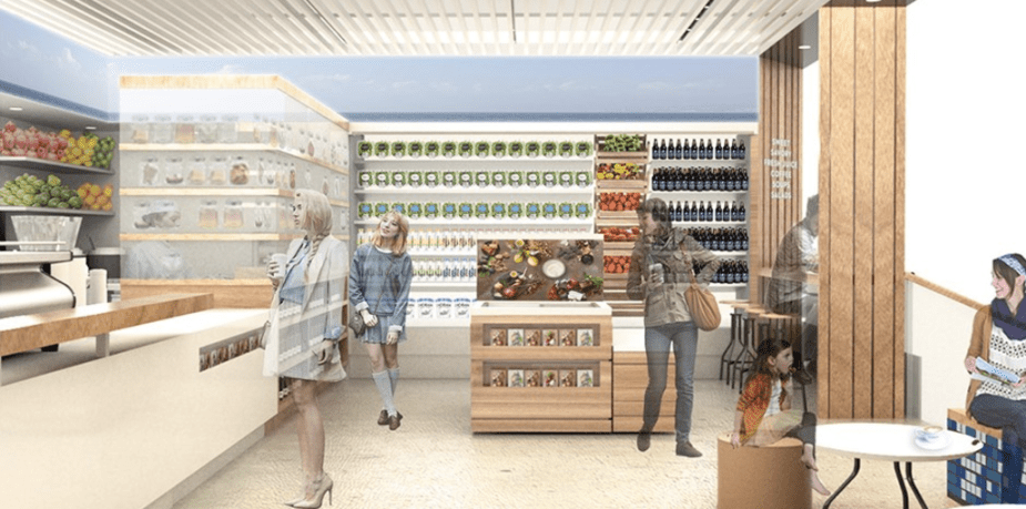
Chobani uses branding to turn yogurt products into food experiences. Image source: Target
Chobani is now a household name for yogurt but founder Hamdi Ulukaya has always pushed beyond the dairy shelf. He has focused on creating a category, rather than just a product.
Chobani’s brand message has been a vehicle for its evolution. “Better food for more people” isn’t just about yogurt, it pushes Chobani into unknown territories, from political arenas to Target department stores.
- Chobani has evolved by taking its brand outside and creating experiences, whether they’re roadside tasting trucks or a set of cafes. Yogurt is still a feature (the cafe menu includes lots of yoghurt-based recipes) but people are starting to associate the name Chobani will a lifestyle rather than just a tub.
- Chobani’s founder is passionate about causes that have affected him in his life. As a Turkish immigrant, he reaches out to immigrant and refugee communities. It’s a risky move that has even caused some far-right supporters to boycott the brand, but as Ulukaya says, “to differentiate your brand, you just have to take risks.”
By making the Chobani brand about more than just yogurt, its founder is building a longer and longer legacy for the brand.
4. Ample Hills Creamery – Let your community determine your brand
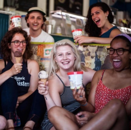
Ample Hills empowers it’s “amployees” to choose their role in the company. Image source: Ample Hills
Ice cream is a growing market. With consumers starting to favor artisanal vendors and adventurous flavors, new ice cream brands face opportunity but also hefty competition. The challenge is to use branding to differentiate offerings.
Ample Hills has grown and differentiated its brand by focusing on place and community. When people visit an Ample Hill store in their neighborhood, they find a unique offering. The creamery isn’t just a product, it’s a place where people can hang out.
Ample Hills has achieved this place-based branding in several ways:
- Team members get to customize their experience, and the customers’ experience. Every “Amployee” gets to design flavors and is encouraged to take up whatever role most excites them in the company. It’s no coincidence that the “People” section of the Ample Hills brand story is longer than the “ice cream” section.
- Ample Hills builds events and hang-outs into their brand. Customers can host parties in the store, and learn how to make ice cream. These events also extend into the wider community. Politics and topical events aren’t taboo. During the recent election, Ample even created flavors for each of the candidates — Madam President and Make America Orange Again.
Grow by incorporating what’s going on around you and you’ll build a community of brand-followers who love you for more reasons than one.
5. Innocent – Stay innocent after partnership
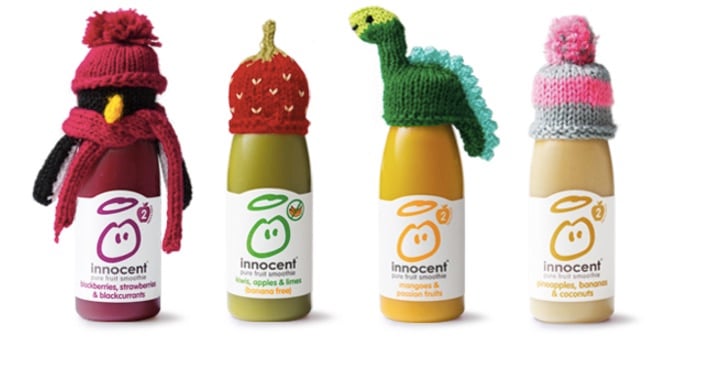
Innocent Drinks has kept its quirky personality despite partnering with giant Coca-Cola. Image source: Age UK
Innocent Drinks grew in the UK with great branding — its identity was “innocence,” but this word had many meanings, from healthy, friendly ingredients, to green initiatives, to community building projects and charitable work. The brand was very much “what we do” rather than “what we look like.”
Innocent then partnered with Coca-Cola, selling its larger share. This was a move that many doubted, Coca-Cola being such a huge, multinational player, surely at odds with the “Innocent” brand. But since the partnership, Innocent has carried on doing what they do.
- Since partnering with Coca-Cola, Innocent has become known for a campaign called the Big Knit. People knit tiny hats for Innocent bottles to wear in stores. 25 pence of the price of each bottle then goes to Age UK, a charity supporting the elderly. This very typically-Innocent campaign takes what Innocent was doing on a small scale and amplifies it out.
- Another way Innocent has kept its innocence is by retaining the personal tone of its well-loved blog. The blog is a running diary of the Innocent team, illustrated with candid pictures and random goings-on. Coca-Cola’s influence may be seen in Innocent’s new reach, but their personality is unchanged.
Keep doing the small stuff with your brand that your followers love, while using funding and mentorship to grow your audience.
6. Bhakti Chai – Put your stamp on good things
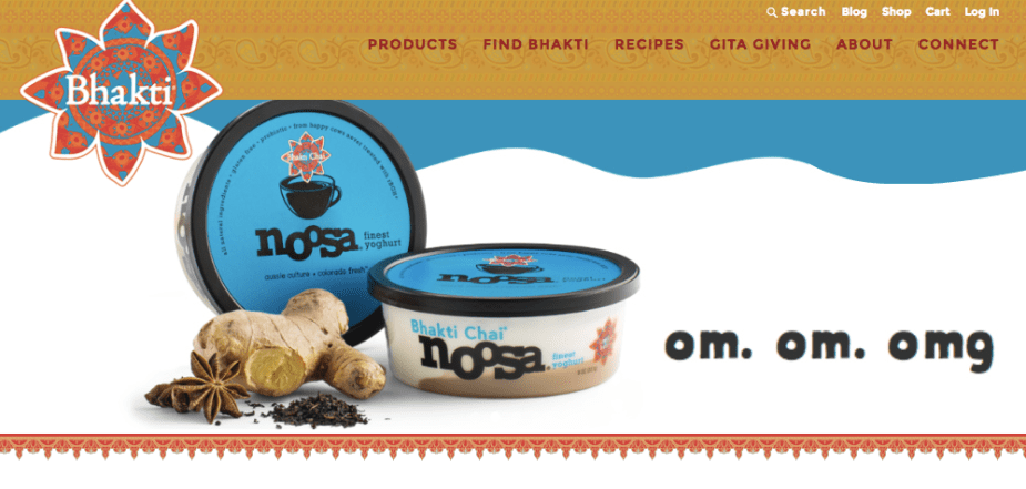
Bhakti Chai adds its signature stamp to other products to expand its audience. Image source: Bhakti Chai
Bhakti Chai has defined its brand with its story. Using colors, design elements, and ingredients based on traditional Indian culture, Bhakti has made its products instantly recognizable.
But as the brand grows it needs to show that it’s more than just a flavor or a color. That’s why Bhakti Chai is partnering with (carefully-selected) other brands, to expand its relevance.
- Bhakti Chai recently put its stamp on Noosa, a product with a very different-looking brand, but with a tribe of loyal customers who intersect with Bhakti Chai’s intended audience. The partnership is a special Chai version of the Noosa yoghurt, sealed by the Bhakti logo. Simple. Yet it does a lot for Bhakti’s brand — because Noosa is trusted by many people, the partnership helps to validate Bhakti Chai and get it into new hands.
- Bhakti founder Brooke Eddy also makes sure that Bhakti regularly travels. This is not just an Indian brand. In Bhakti’s branded Tuk-Tuk (called Ginger), the Bhakti team appears at events, like the SXSW music festival in Austin.
By making friends with other brands, you’ll avoid getting stuck in a brand box. You’ll expand your reach while sharing your unique story.
7. TOMS – Do things with your brand

TOMS takes its flag wherever it goes to show that its brand is more than just shoes. Image source: TOMS
The TOMs logo (an Argentinian flag with the name TOMS stitched across the middle) is well recognized but it really has nothing to do with shoes. This could seem like a strange choice for a fashion brand but it works for TOMS.
By going out into the world and performing projects related to the TOMS brand mission, TOMS shows, rather than tells, what it’s all about.
- TOMS evolves its brand, not through designs or colors but by what it does. Every purchase contributes something to one of TOMS’ chosen causes. As the brand has grown, so has the giving, and TOMS now partners with over 100 other charities and organizations.
- As the TOMS label pivots to new products, they pivot their work on the ground to address new challenges. TOMS could equally be known for eye care as shoes now, because as it’s expanded its eyewear section, it has gone into communities in need and provided eye operations for cataracts and trachoma.
You don’t have to journey to South America to build a “doing” brand. Start raising your brand flag as you engage with your own community.
8. Garmin Outdoor – Test and iterate your brand
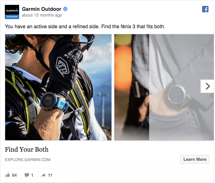
A Facebook ad that expresses the two sides of Garmin Outdoor’s brand. Image source: AdEspresso
Garmin is an outdoor fitness and fashion brand that aims to have a double-sided identity for consumers. On one side is a “refined” personality, apparel for going out in a social and work setting. The other side is all about the outdoors. Fitness wear, extreme sport accessories, functional gear.
Garmin uses clever branding strategies to unite these two sides of its identity in the eyes of consumers.
- The folks at Garmin utilize Facebook ads to share the two sides of its brand side by side. With the tagline “Find Your Both,” Garmin turns a potentially confusing duality into a single identity that attracts different buyers to browse.
- Garmin uses a tool called AdEspresso to manage these Facebook ads. It doesn’t just use the split-window feature to showcase its two identities, it also split-tests its ads, experimenting and iterating on the most successful.
Branding isn’t just an art, it’s a science too. Test aspects of your brand on your intended audience and gather data that helps you evolve intelligently.
9. Public Bikes – Practice design-first evolution
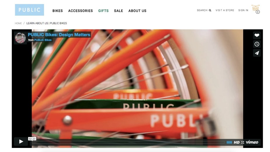
Public bikes uses video to show its design-first branding in motion. Video source: Public
Public is a growing brand, adding more and more products to its inventory. From bikes to accessories to clothing, it’s not just the name that ties this growth together. As Public gently pivots into new areas, it uses design elements to lead the way.
Design is everything for Public. It’s the way a rider moves with the bike. It’s the way an accessory stands out in a crowd. Founder Rob Forbes leads Public in a design-forward way, so that every stage of the brand’s evolution looks natural.
- Public’s trademark orange and blue colors come from their origin story — inspired by the people-friendly streets and canals of Amsterdam. Rob Forbes brings these colors and principles through everything he designs. This is how Public takes its history forward, and is able to evolve products that all take part in the Public world.
- Public celebrates design through its branding materials. The team uses video on its website to show how the Public bike’s design allows riders to stand and navigate comfortably. It also shows riders hanging out between rides, calling attention to the social aspect of the brand.
A brand is the sum of many parts. Design each part with the same mindset and a cohesive brand will follow.
10. Black & Decker – Simplify as you grow
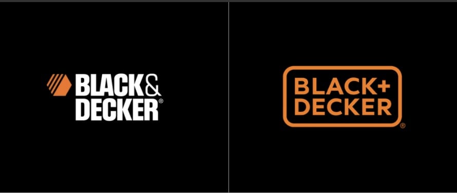
Black & Decker’s logo redesign simplifies and modernizes to attract today’s consumers
Founded in 1910, Black & Decker has grown its brand for over a century and become a household name for hardware. The brand has always used a nut-shaped logo in black and orange, but as they grow and as their market changes drastically — from a brick and mortar world to an online one — Black & Decker’s brand is paring back its design.
Various iterations have simplified and modernized the logo and text, and now B&D has revealed its newest iteration. The historic logo is gone and the old-fashioned ampersand has become a stylish plus sign. This redesign works for Black & Decker for several reasons:
- Color is the most instant hit of B&D’s brand. By keeping the traditional orange and black consistent, customers still get that first impression that helps them recognize the brand’s quality.
- By slimming down the lettering and enclosing it with a smooth orange line, the B&D brand team has made turned text and logo into a single stamp. Less complicated. Quicker to digest. Better-equipped for a fast-paced world.
By retaining its most recognizable elements, Black & Decker is able to change significantly and still retain its iconography.
It’s Survival of the Bravest
Animals that adapt successfully don’t just passively react to their changing environments. They actively select for the qualities that will thrive. Practice bold evolution to build up your brand from a set of elements — aesthetics, ethics, and principles — and then make choices that push those elements in new directions. Whether you’ll start a cafe, go on a medical mission, or add your stamp to a totally different product, focus on the experience you’re creating and your brand will follow.
Great brands aren’t scared of changing. They move boldly into new eras and new markets without looking back.